Project Description
search by service | by industry
Client K. Raheja Realty
Project Strategic Brand Identity
Making It Real
Making It Real
Challenge
When K. Raheja Constructions changed its brand name to K. Raheja Realty, they required a fresh new visual identity and a brand strategy that would be distinct and differentiated.
Interpretation
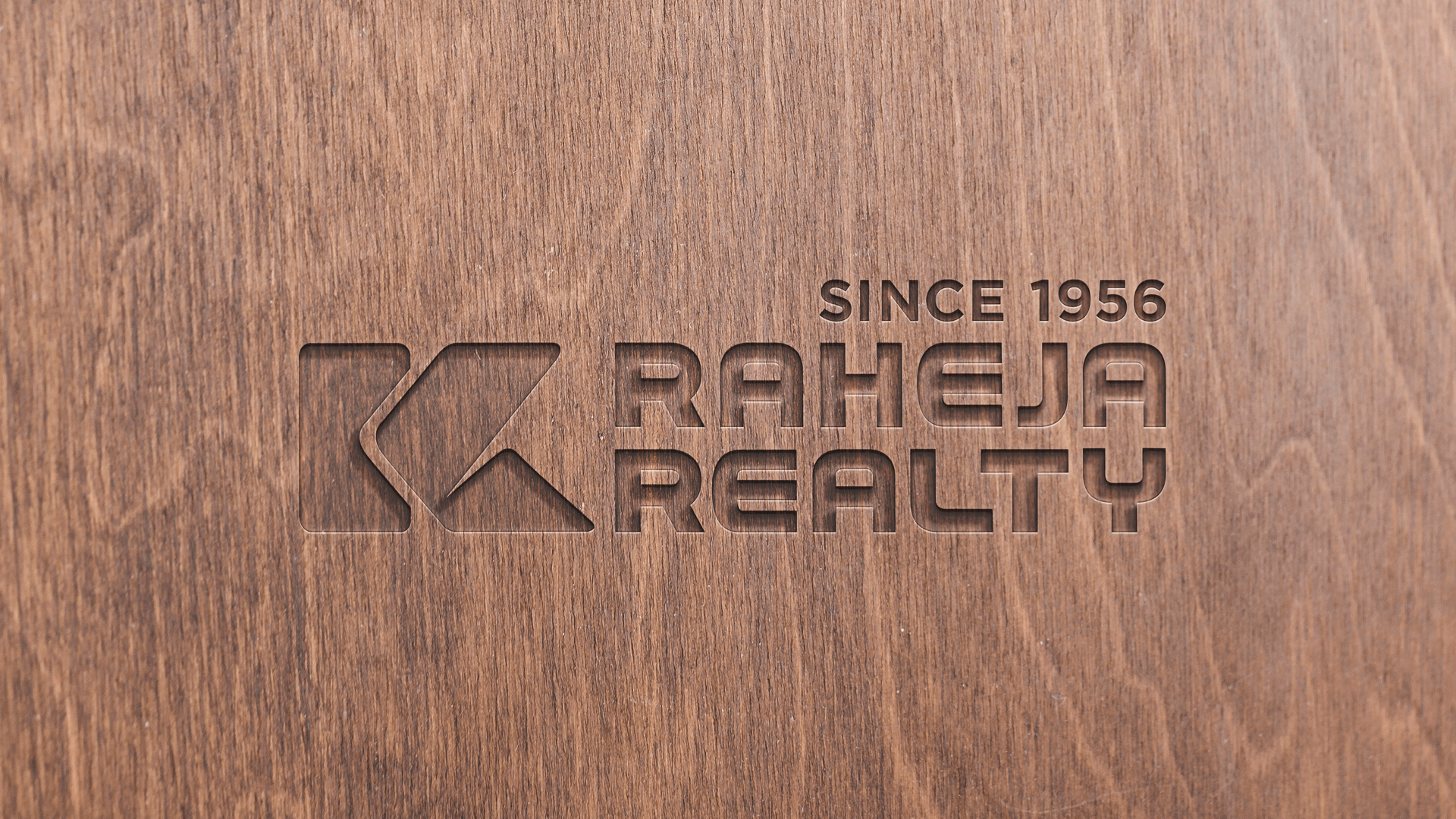
Through in-depth interviews, immersion and customer insights we arrived at the firmʼs values as a Progressive, Innovative and Reliable provider of homes, hospitality and commercial spaces. In order to retain brand loyalty in an increasingly competitive marketplace our client retained their tagline which spoke of their distinct advantage of having been a market leader and consistently delivering quality to their customers ʻSince 1956ʼ.
Solution
The form of the identity was inspired from the idea of growth through consistent excellence in quality. As a realty firm, they make good on their customer promises. They go the extra mile. This idea is captured through the circular movement of a bold arrow that locks into place in a vertical structure that forms the letter K. The identity is paired with its legacy typeface to stay memorable.
